Quick answer
Good visual design rests on a few principles: hierarchy (the most important thing is most prominent), alignment, contrast, proximity (related things sit together), repetition (consistent styles), white space, and disciplined colour and typography. Apply them and almost any flyer, slide, post or document becomes clearer and more professional.
You don't need to be a designer to make things that look designed. Most of what separates amateur from professional layouts comes down to a handful of principles that apply to everything: a poster, a resume, an infographic, a slide. This guide explains each one with practical rules you can use today.
In this article
1. Hierarchy: decide what's read first
Every layout needs an order: what the reader sees first, second and third. Create it with size, weight, colour and position. Typically that's a headline, then a key image or number, then supporting text, then details like dates and contact information.
A quick test: squint at your design. The things you can still make out should be the things that matter most.
2. Alignment: everything lines up with something
Place every element on an invisible line shared with something else. Left-aligned text is easiest to read for longer content; centred text suits short headings and invitations. Mixing alignments without a reason is one of the most common signs of an unplanned layout.
A simple grid — two, three or four columns with consistent margins — makes alignment easy and keeps pages consistent.
3. Contrast: make differences obvious
If two things are different, make them clearly different — a large bold headline against regular body text, not 16 pt against 14 pt. Contrast also means readable colour: text needs enough difference from its background.
The Web Content Accessibility Guidelines (WCAG) level AA asks for at least 4.5:1 contrast for normal text and 3:1 for large text (roughly 18 pt, or 14 pt bold). It's a good standard for print and social graphics too.
Try the free Contrast Checker (WCAG)Check any text and background colour pair against WCAG contrast rules.Our colour contrast guide explains the ratios in detail.
4. Proximity and repetition
Proximity: group related items and separate unrelated ones. A heading should sit closer to the text it introduces than to the section above. Event date, time and place belong together in one block.
Repetition: reuse the same styles for the same kinds of things — every heading the same font and size, every icon the same style, every button the same shape. Repetition is what makes a multi-page document or a social feed feel like one design.
5. White space is not wasted space
Empty space gives the eye a place to rest and makes the important parts stand out. When a layout feels crowded, the fix is usually to remove something rather than shrink everything. Generous margins alone make most documents look more professional.
6. Colour with restraint
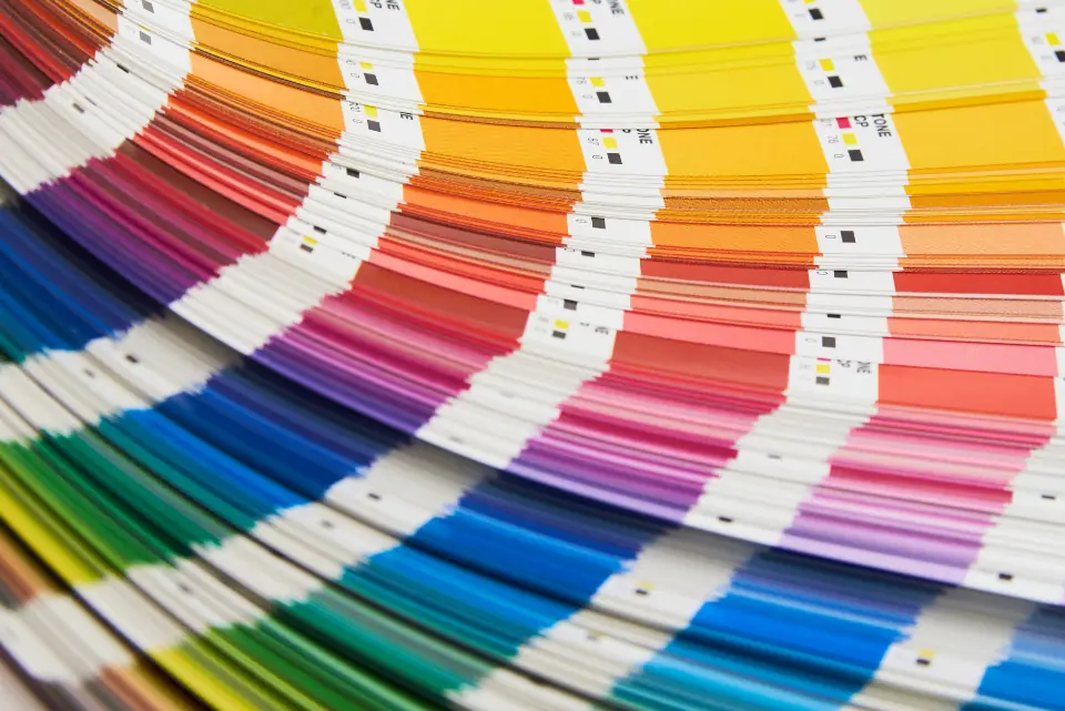
- Limit the palette: one or two main colours, a neutral for text and backgrounds, and one accent for calls to action or highlights.
- The 60-30-10 guideline is a useful starting point: about 60% dominant colour (often a neutral), 30% secondary, 10% accent.
- Use colour to mean something — the same colour for the same kind of thing throughout.
- Don't rely on colour alone to carry information; add labels or icons for people with colour-vision deficiencies.
7. Typography: two fonts and a clear scale
| Rule of thumb | Why |
|---|---|
| Use at most two typefaces | More looks chaotic; one family with several weights is often enough |
| Pair a distinctive heading font with a plain text font | Personality where it shows, readability where it counts |
| Set a size scale (e.g. 32 / 20 / 14) | Consistent steps make hierarchy obvious |
| Keep line length to about 50–75 characters | Long lines are tiring to read |
| Give body text line spacing of about 1.4–1.6 | Improves readability of paragraphs |
A quick design checklist
- Is it obvious what to read first?
- Does everything align to a shared edge or grid?
- Is the text readable — size and contrast?
- Are related items grouped, with space between groups?
- Are styles consistent: fonts, colours, icons, spacing?
- Could you remove one more thing?
Put these principles to work in infographics, presentations and social media posts.
Try the free Flyer MakerEdit a flyer template for events, sales or services and download it for print or social.Frequently asked questions
What are the basic principles of visual design?
Hierarchy, alignment, contrast, proximity, repetition, white space, and disciplined use of colour and typography.
How many fonts should a design use?
Usually no more than two: one for headings and one for body text. A single family with several weights is often enough.
What is the 60-30-10 colour rule?
A guideline for balancing a palette: about 60% dominant colour, 30% secondary colour and 10% accent colour for emphasis.
What contrast ratio does text need?
WCAG level AA asks for at least 4.5:1 for normal text and 3:1 for large text, which is roughly 18 pt regular or 14 pt bold.