
Quick answer
Engaging social posts stop the scroll with one clear idea, are designed for the platform's size, and give people a reason to react — something useful, surprising, relatable or beautiful. Use a bold headline of a few words, a strong image or simple graphic, readable text on a phone, consistent brand colours, and a caption that adds context and ends with a specific prompt.
People scroll fast, usually on a phone, often with the sound off. A post has a moment to show what it's about and why it's worth stopping for. That's less about trends and more about clarity: one message, designed to be read at a glance, offering something the audience values. Here's how to plan, design and write posts that do that.
In this article
Start with what the audience gets
Before designing, decide what the post gives the person who sees it. Most engaging posts fall into a few types:
| Post type | Why people engage | Example |
|---|---|---|
| Educational | They learn something useful and save it | “5 Excel shortcuts that save an hour a week” |
| Behind the scenes | They feel connected to real people | How an order is packed in your studio |
| Proof | They trust you more | A customer quote or before-and-after |
| Relatable / opinion | They agree, disagree or tag a friend | “Unpopular opinion: meetings should have an agenda” |
| Announcement | They don't want to miss out | A launch, event or limited offer |
A good mix stops your feed from feeling like constant advertising.
Design for the platform's size
| Format | Recommended size | Aspect ratio |
|---|---|---|
| Instagram portrait post | 1080 × 1350 px | 4:5 |
| Instagram square post | 1080 × 1080 px | 1:1 |
| Instagram Story / Reel cover, TikTok | 1080 × 1920 px | 9:16 |
| LinkedIn / Facebook feed image | 1200 × 1200 px or 1080 × 1350 px | 1:1 or 4:5 |
| LinkedIn document carousel | 1080 × 1350 px pages, uploaded as PDF | 4:5 |
Portrait (4:5) posts take up more of the screen in the feed than square ones. Keep important text and faces away from the edges: Stories place the profile name at the top and reply bar at the bottom, and profile grids crop posts into smaller previews.
Make it readable in one second
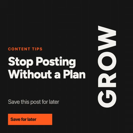
- 1One headline of a few words, big enough to read at thumbnail size.
- 2One focal point: a face, product or simple graphic — not five competing elements.
- 3High contrast between text and background. Add a solid panel or dark overlay behind text on photos.
- 4Brand consistency: the same two fonts and a small palette, so followers recognise your posts.
- 5Space to breathe: remove anything that doesn't support the headline.
Carousels for teaching and storytelling
Multi-slide carousels suit step-by-step tips, lists and stories because each swipe reveals the next point. Make the first slide a strong promise (“How to price your first freelance project”), put one idea on each slide, keep a consistent layout, and end with a summary or a clear next step.
Try the free Social Media Carousel MakerDesign Instagram and LinkedIn carousels slide by slide and download images or a PDF.
Captions that add something
- Front-load the first line — it's often all people see before “more”.
- Add what the image can't: context, a story, the detail behind the tip.
- Break text into short lines so it's easy to read on a phone.
- End with a specific prompt: “Which of these do you use?” works better than “Thoughts?”.
- Use a few relevant hashtags rather than a long block of generic ones.
- Add alt text describing the image so people using screen readers can follow.
Consistency beats occasional brilliance
A realistic schedule you can keep — even two or three posts a week — builds more familiarity than bursts of daily posting followed by silence. Save time by creating a few templates for your regular post types and reusing them with new content. Check what your audience saves, shares and comments on, and make more of that. For layout and colour basics, see principles of good visual design.
Frequently asked questions
What size should an Instagram post be?
1080 × 1350 px (4:5 portrait) takes up the most space in the feed; 1080 × 1080 px is the square option. Stories and Reel covers are 1080 × 1920 px (9:16).
How do I make social media posts more engaging?
Offer something valuable, such as a tip, story or proof; use one clear headline and focal point; make text readable on a phone; and finish captions with a specific question or next step.
How much text should be on a social media graphic?
As little as possible: a short headline and, at most, a few supporting words. Put detail in the caption or across carousel slides.
How often should I post?
As often as you can sustain with quality. A steady schedule of a few posts a week usually works better than bursts followed by long gaps.