
Quick answer
For most people the reverse-chronological format is the best choice in 2026: your most recent job first, in one clear column, with a short summary and a skills section. Use a combination (hybrid) format if you're changing careers or your skills matter more than your job titles, and treat the functional format as a last resort — recruiters and applicant tracking systems both find it hard to read.
“Format” means two different things when people talk about resumes. The first is structure: what order your sections go in, and whether your experience is organized by date or by skill. The second is layout: one column or two, fonts, spacing, and the file type you send. Both affect whether the right person reads your resume, and for how long.
This guide covers both — the three standard structures, when each one works, and the layout choices that keep your resume readable for people and software.
In this article
The three resume formats compared
| Format | How it's organized | Best for | Watch out for |
|---|---|---|---|
| Reverse-chronological | Work history first, newest role at the top | Steady career in one field; most applications | Gaps and short stints are easy to see |
| Combination (hybrid) | A skills or highlights section first, then work history by date | Career changers; specialists; senior people with varied roles | Can run long — keep the skills section tight |
| Functional (skills-based) | Grouped by skill, with little or no timeline | Rarely the best choice | Recruiters may assume you're hiding something; ATS may misread it |
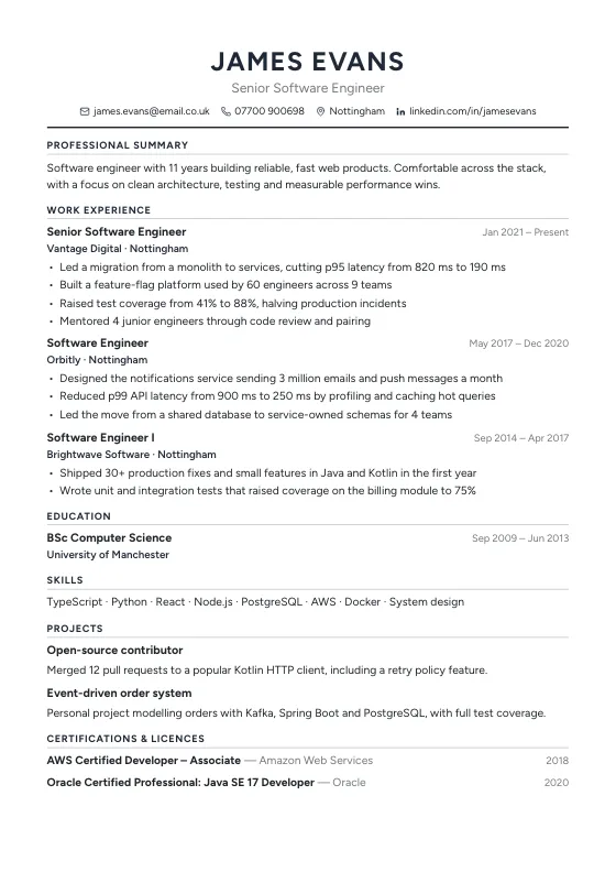
Recruiters skim. They want to see what you do now, where you did it and what came of it, and the reverse-chronological layout answers those questions in the first third of the page. That's why most career services and hiring guides recommend it as the default.
Reverse-chronological: the safe default
A typical order is:
- 1Header: name, job title you're targeting, phone, email, city and a LinkedIn or portfolio link.
- 2Professional summary: two to four lines on who you are, your strongest skills and what you want next.
- 3Experience: each role with title, employer, location and dates, then three to six achievement bullets.
- 4Education and any certifications.
- 5Skills: tools, languages and methods named the way job adverts name them.
If you're a recent graduate, move Education above Experience and add projects, internships or volunteering — anything that shows what you can do.
Combination format: for career changers
A combination resume opens with a “Key skills” or “Selected achievements” section of three to five points that match the new role, each backed by a result. Your work history follows in date order, so nothing looks hidden.
Example: a teacher moving into instructional design might lead with “Designed 40 hours of blended-learning modules used by three year groups” and “Trained 12 colleagues on the school's learning platform”, then list teaching roles below. The employer sees the transferable skills first and the timeline second.
Why the functional format usually backfires
A purely skills-based resume removes dates and job context. People use it to hide gaps, but recruiters know that, and many treat a missing timeline as a warning sign. Applicant tracking systems also expect to find job titles, employers and dates, so a functional layout can parse badly.
If you have a gap, a better approach is to list it honestly as a line in your history — “Career break: caring for a family member, 2023–2024” — or mention courses and freelance work you did in that time.

Layout: one column or two?
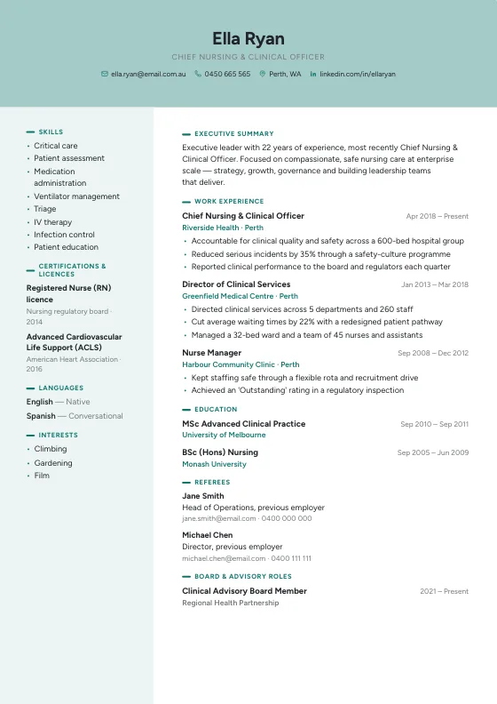
One-column layouts are the most reliable: everything reads top to bottom, in the order software extracts it. Two-column designs with a sidebar can look polished and fit more on a page, and many modern applicant tracking systems read them well — but not all do, and a skill tucked into a sidebar can end up out of order.
| Applying through… | Safest layout |
|---|---|
| A large company's online portal | One column, standard headings |
| A recruiter or a direct email | One or two columns — design matters more here |
| A creative role (design, marketing) | Two columns or a stronger visual style, plus a portfolio link |
Length, fonts and file type
- Length: one page is usual for students and people with a few years of experience; two pages is normal for experienced professionals. Academic CVs and some government roles run longer.
- Fonts: a clean, common typeface at 10–12 pt for body text, with headings a few points larger. Avoid script or condensed fonts for body copy.
- Paper size: US Letter in the US and Canada, A4 almost everywhere else.
- File type: a text-based PDF keeps your layout intact. Send a Word file (.docx) only when the employer asks for it.
- File name: “Firstname-Lastname-Resume.pdf”, not “resume_final_v3.pdf”.
Whatever format you choose, test it: open the PDF, select all the text and paste it into a plain text editor. If the order is jumbled or words are missing, applicant tracking software will have the same problem. Our guide to ATS-friendly resumes goes deeper on this.
Try the free ATS Resume CheckerCompare your resume with a job description and see which requirements it doesn't yet show.Frequently asked questions
What is the best resume format in 2026?
Reverse-chronological is the best format for most applicants: it shows your most recent and relevant work first and is the easiest for recruiters and applicant tracking systems to read. Career changers often do better with a combination format.
Is a two-column resume bad for ATS?
Not always. Many modern systems read two columns correctly, but some read across the columns and mix up the text. If you're applying through a large company's portal, a one-column layout is the safer choice.
Should my resume be one page?
One page suits students and early-career applicants. With several relevant roles, two pages is normal. Cut anything that doesn't support the job you're applying for before cutting useful detail.
PDF or Word for a resume?
Send a text-based PDF unless the employer asks for Word. A PDF keeps your layout identical on every device; just make sure the text can be selected, not saved as an image.